Eastham is a tough town to describe when viewed from above. There's not really a word for her shape. You could never sketch a map of Eastham from memory, like you could do with, say, Wyoming.
All of those coves and marshes and tidal creeks and barrier beaches combine to make a tricky hurricane forecast for the Easternmost Ham.
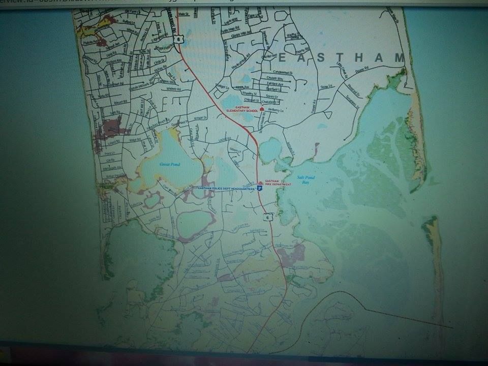
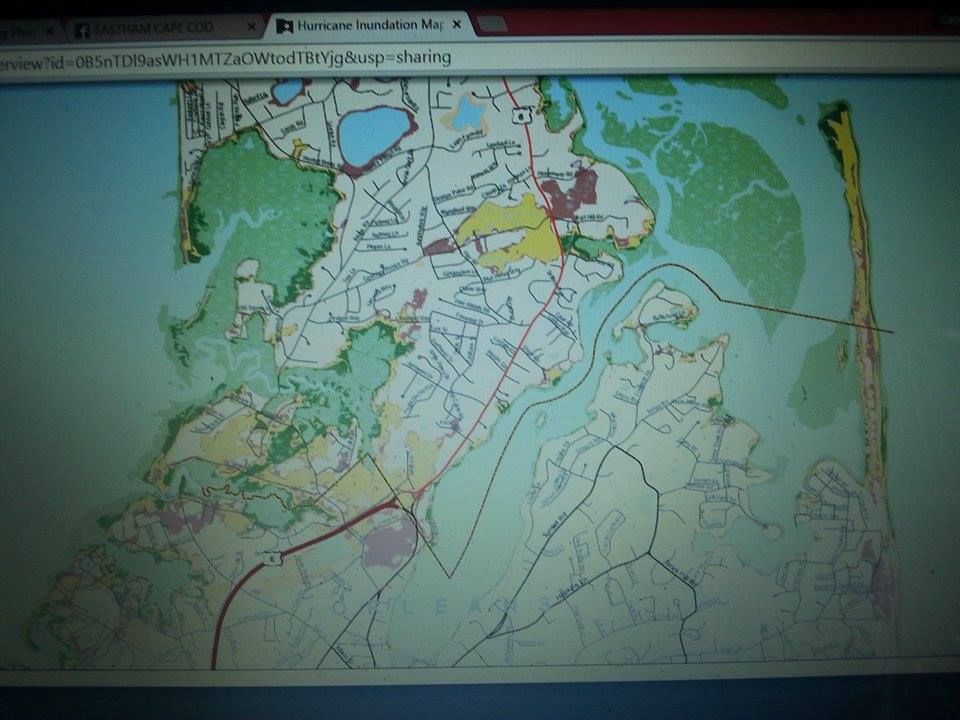
We have two maps for you to peruse. They come from an amalgamation of FEMA, MEMA, NOAA, and NHC. The map at the top of the page, and the ones in the article which look like it, are Hurricane Inundation Maps. They are based on the zany-weatherman-titled SLOSH model.
The Inundation maps are related to storm surge, which is seawater pushed inland ahead of a storm. Some of our past hurricanes have sent ashore some doozies. These maps show where storm surge is forecast to come ashore. They also purport to show how far inland storms of differing intensities will reach.
I'll leave the neighborhood-by-neighborhood discussion to the readers, who can zoom in on their particular house if they so desire by going to this page and clicking around a bit.
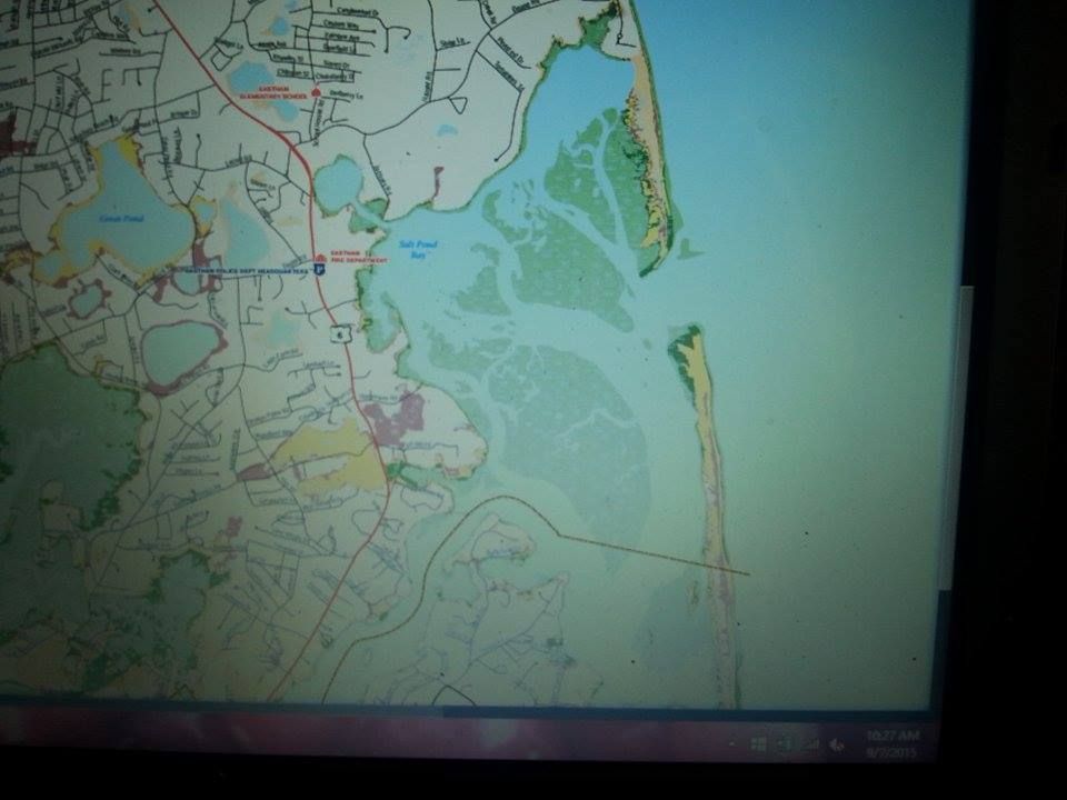
The picture quality is rough- I couldn't SAVE AS or PRTSC these pages for some reason which may be drug related, and instead took pictures of my screen with the girlfriend's phone- but a determined reader can figure out what they need to see.
Here is the color code we'll be using:
Light Green = Category 1 hurricane. That's the minimal kind, the weakest hurricane. The Halloween Gale is a good-if-offshore example of this kind of action.
Darker Green = Category 2 hurricane. While the landfall was far west of Eastham, Hurricane Bob was a Category 2 storm when it hit Rhode Island.
Yellow = Category 3 hurricane. Only five hurricanes of this intensity have hit New England since the people from Old England showed up, the last being Carol in 1954. Eastham's population was about 900 back then.
Red = Category 4 hurricane. They're estimating from almost 400 years ex post facto, but the Great Colonial Hurricane of 1635 may have been a Category 4 storm.
Flesh = 100 Year FEMA Flood Zone. This is the "hundred year storm." Brown University scientist-types measure pre-Colombian storm impacts by taking long tubes of marsh mud and analyzing sand layers which could only be put there by giant storms. New England was hit by Category 4+5 storms in 1100–1150, 1300–1400 (1295–1407), and 1400–1450 (1404–1446).
I'm no artist, and I use "flesh" as a color primarily because of whoever was in charge of Color Naming at Crayola in 1970. There's probably a better term. Inundation maps are very egalitarian, and due to their using White as a base color on the map, the "colored" neighborhoods are generally the less-swarthy waterfront-property-owning types of people.
Please note that these maps depict a scenario where a direct-hit hurricane arrives at mean high tide. Also note that they do not show impacts from freshwater flooding scenarios like heavy rainfall, freshwater stream overflow, sewer backups and even sociopaths spraying their garden hoses into the wind for the sheer joy of it.
A few quick notes about the maps:
- A monster storm will reach inland far enough to cut off Route 6 in a few spots. You should try to be Ghost before that happens.
- Anything marshy will go under in a minimal hurricane.
- The only Flesh colors we see are on the outer dunes, and in a few spots by the fire station.
- I'm probably a bit late to this dance, but you could make a pretty good cheesy horror film about a hurricane flooding Eastham which also pushes sharks ashore to grab people out of The Friendly Fisherman and so forth.
- North Eastham should be called Nor'eastham.
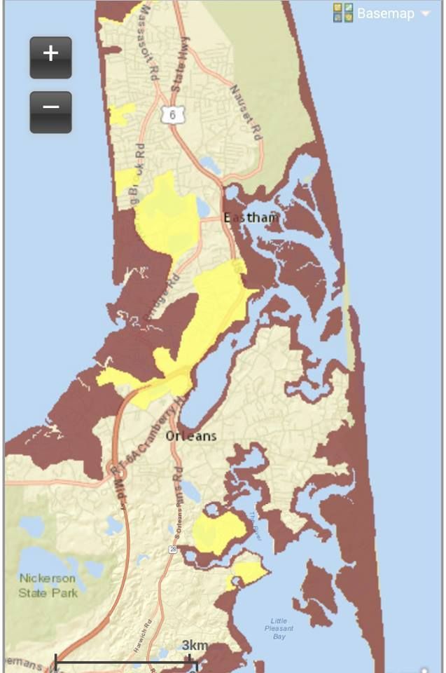
We also have an Evacuation map for you. These are what the authorities use to determine who will be under evacuation orders.
You don't HAVE to evacuate, but that cop you told off before the storm may end up being the one who has to decide whether he should risk his neck to pull you out of a flood.
These maps are a bit easier to read than the Inundation maps. We only have two colors here. Red means Get Out, and Yellow means Get The F*** Out.
You should pay heed to these maps. We want you alive. We need your site visits, we have professional pride ("If they read my column, they'd be alive"), and we also want you alive for regular nice-person reasons.
"I advocate hanging on as long as possible."
No comments:
Post a Comment